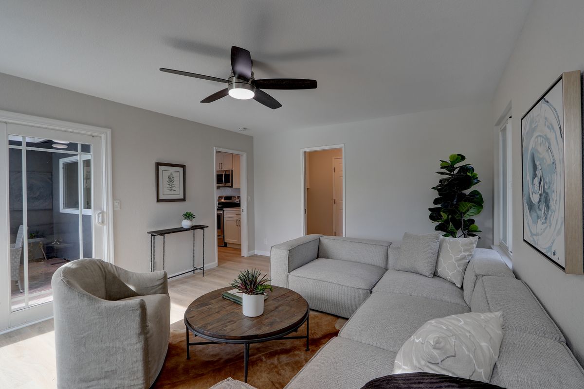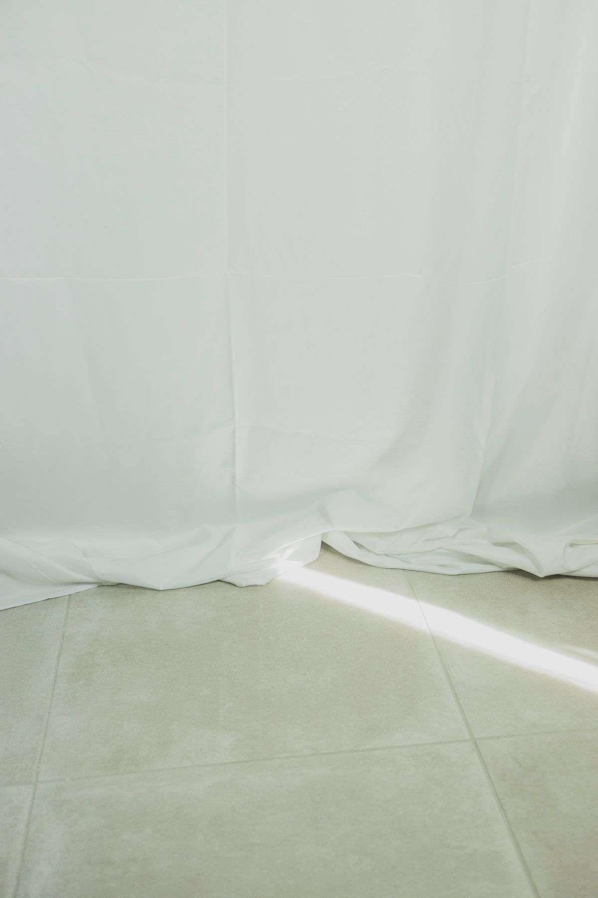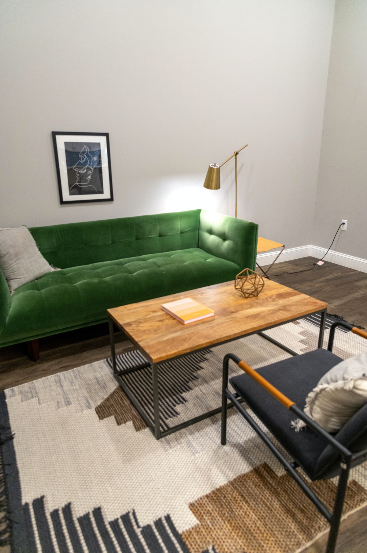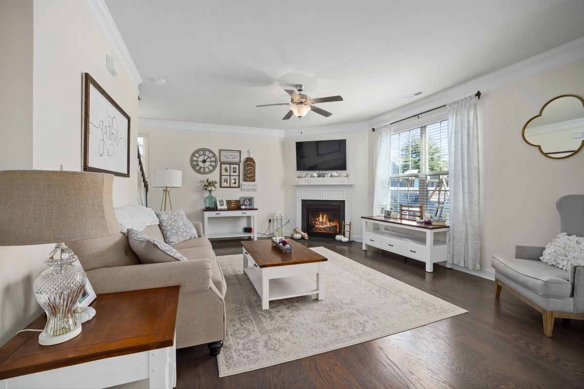
Notice the colours already present
Oak flooring, a cream worktop or yellowish woodwork already contributes to the palette. Put fabric and paint samples beside these fixed elements before choosing a wall white. A sample may look neutral alone but reveal pink, green or grey undertones next to another material.
Use samples large enough to judge from a distance. Look during daylight and with your lamps on. Do not try to compensate for very cool lighting by buying everything in beige without checking the light itself. First decide whether that lighting is something you intend to keep.
Give each shade a job
You might use the lightest tone on large surfaces, a middle shade for the sofa and a deeper one on a table or lamp. This is a way to organise a composition, not a compulsory formula. What matters is that the eye can distinguish the pieces and find somewhere to pause.
If the wall and sofa have similar colours, vary texture or outline. An obvious woven fabric, smooth timber and a paper shade read differently even within one colour family. Consider how they age and how they are cleaned as well; an interesting texture should not create maintenance you do not want.
Add a small amount of contrast
A dark frame, a brown tray or green plant can provide definition without disturbing the calm. Repeat one detail sparingly elsewhere if you want it to feel intentional. There is no need to distribute the same accent across every corner of the room.
Contrast can also come from shape: a round table against a straight sofa, or a matt object beside glass. Before buying anything, temporarily remove a few ornaments. Sometimes the room needs more space between its elements rather than another layer of decoration.
Test one complete area
Gather a cushion cover, a curtain sample and something you already own on the sofa. Watch the combination over several days, with the bed or table left as it normally is rather than prepared for a photograph. The palette should still feel pleasant when everyday life enters the room.
If it looks flat, change just one variable. A lighter cover or a shade that distributes light differently might be enough. Photographs taken from the same position can help compare arrangements, but remember that a phone changes colours. Make the final decision while looking at the actual materials, including the finishes that cannot easily be replaced.